Button or no button?
This article was re-posted from my weekly newsletter. Want to read it a week early? Subscribe to Design Insight.
Buttons in cars are helpful. They allow you to perform a specific action in the car without having to take your eyes away from the road.
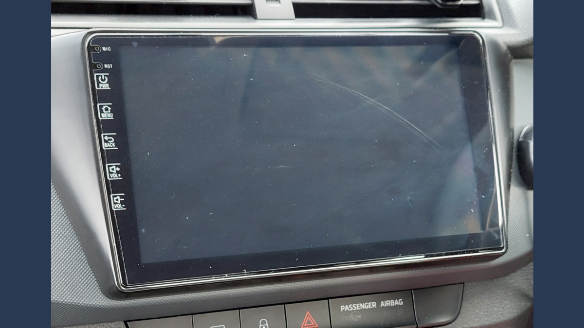
About 2 years ago I had my car’s stock radio replaced with an Android-based device (basically a tablet).
I thought it would look cool and give me more features when listening to music in the car or navigating via GPS.
Cut to today and I’m ready to revert back to the original stock radio with all its knobs and buttons 😭
Here’s why:
- It’s a flat surface with no buttons and is a nightmare to use while driving.
- The volume up and down “buttons” are flat and don’t light up so at night, you’re on your own with regards to volume control.
- Connecting to Bluetooth is always an issue and it’s something I can’t attempt when driving due to the amount of concentration it requires.
- Navigating through the UI is so slow and clunky it hurts me 😅.
- There’s no audio or haptic feedback when you interact with the device which means you need to rely on visuals i.e. looking away from the road.

This got me thinking about the importance of physical buttons as a way to interact with our cars in an easier, safer way.
Fasten your seat belt 🚗 (yes I said it), and let me share with you everything I learned on this deep dive.
Large Screens Are Everywhere
Touch screens or infotainment devices are becoming more common in cars, thanks in part to the success of the smartphone. In 2020, 98.8% of all new cars sold in the US feature a digital display screen (according to Consumer Reports).
There are advantages to touch screen devices in cars:
- It’s cheaper and easier for manufacturers to install one screen as opposed to a variety of knobs and buttons.
- Because car infotainment systems these days do so much, the number of physical controls needed to, well, control it all would make your car look like the cockpit of an airplane!
- From a design perspective you can’t argue the lack of physical buttons provides a clean and simple aesthetic.
The problem with these touchscreen devices is they are rapidly replacing actual buttons, knobs, and switches that drivers are used to. Tesla’s cars have one giant screen which controls almost all the car’s functions.

The Data Backs Up Buttons
There is data now to prove that relying on touchscreen devices alone in cars doesn’t result in an accessible experience.
In a test carried out by Vi Bilägare, several modern cars plus one old school car (a 17-year-old Volvo V70) were tested to see how long it took users to perform various tasks.
“The easiest car to understand and operate, by a large margin, is the 2005 Volvo V70. The four tasks is handled within ten seconds flat, during which the car is driven 306 meters at 110 km/h.”
You can read more about that study here: Physical buttons outperform touchscreens in new cars, test finds.
Buttons in cars are good because:
- Over time you build up muscle memory of where buttons are located in the car. You can reach down and turn the hot air to cold air without your eyes leaving the road.
- Physical controls give you immediate audio and haptic feedback. When you press the button to turn on your hazards you feel and hear the click, then you’ll hear the “tick tick” sound of the hazards so you know they’re on. Again, all this can be perceived without your eyes leaving the road.
It’s not just me, other people miss physical buttons in their cars!
Products are now being developed to add them back into cars. Take for example the Ctrl-Bar. It’s an Indiegogo-funded device with 2 knobs and 2 buttons, designed to sit under the Tesla Model 3/Y display.
Even phones are giving us ways to add buttons back into our lives. The iPhone now has an accessibility option that allows you to add a virtual home button to your screen.
Here’s how to do it if you’re interested: How To Give A Modern iPhone That Classic Home Button Experience.
Finding A Balance
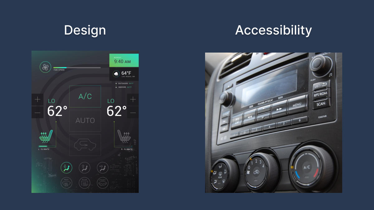
A well-designed product should have a balance between design and usability.
Sure a minimal aesthetic is a beautiful sight to behold but it shouldn’t be at the expense of people’s safety.
Consider how much concentration you need to have while driving. You need to be prepared for anything; other cars stopping suddenly, traffic lights changing, pedestrians wandering out onto the road. Every ounce of your brain’s capacity to pay attention to the world around you is taken up by driving.
Now try to turn on the hot air.
Would you rather reach down to the exact spot the dial is in and twist it all the way to the right? Or would you rather look at a screen for 5 minutes to try and remember which setting or sub-menu the heating is controlled from, then try to poke at the screen and make sure the poke was successful?
I’m slightly exaggerating here for effect but the premise still stands.
During my deep dive, this is the best way I saw it put: it’s like car manufacturers are trying to turn cars into big phones.
Even now this still hits.
Sure it might be cool in a futuristic world where cars drive themselves, but right now we need to consider the user who needs to pay full attention to the road.
Side Note: I have to mention this for all you web enthusiasts out there. The car is where we adopted a lot of web terminology including the radio button:
“Tim Berners-Lee and Dan Connolly were the first to define radio buttons, as well as checkboxes. At the time, car radios most often had buttons for presets, where a person could only press one button down at a time.”