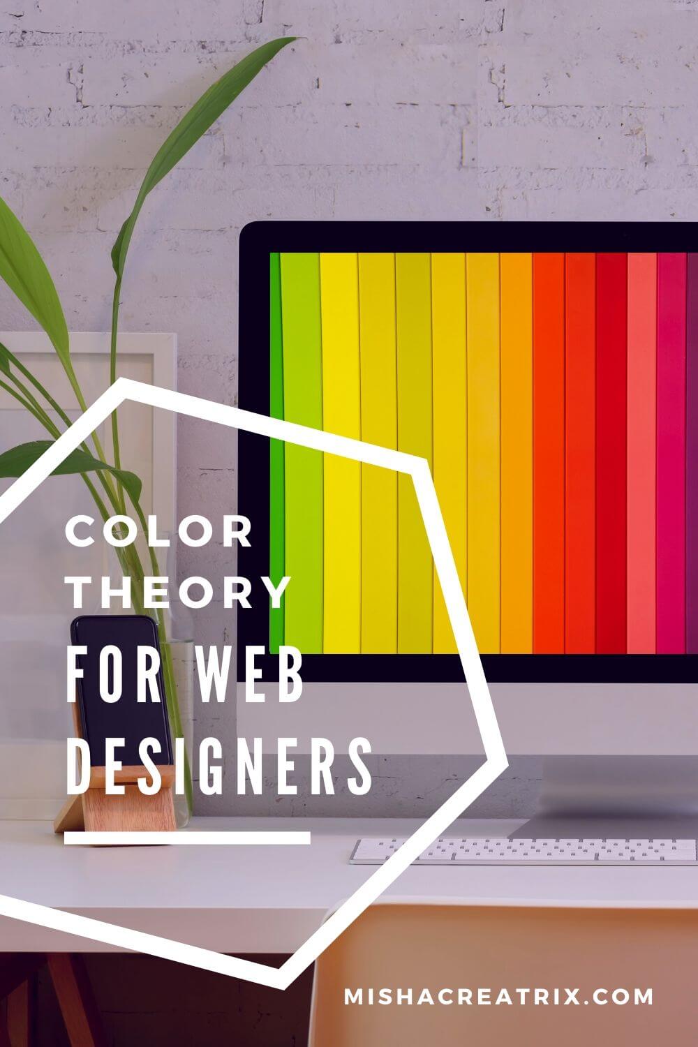
A Starter Guide - Color Theory For Web Designers
Color theory is a fundamental concept used in a wide variety of disciplines, from artists to architects to web designers.
Ever wondered how interior designers create color schemes for their rooms?
You can be sure they are using their knowledge of color theory.
Knowing just a small amount about this subject will help you in many more ways than you might realize as a web designer.
I have written this article to give you a quick and easy to follow starter guide to color theory for web designers.
I’ll be covering some common terms associated with color theory in addition to examples of websites that utilize different colours to portray different meanings.
Color Wheel
The color wheel, also known as the color circle, is an arrangement of colors based on their hues.
The color wheel is designed to show different colors’ relationships i.e. primary, secondary, tertiary (Don’t worry if these terms sound weird, I’ll be explaining them more in the next section).
Artists and designers alike have used the color wheel at one time or another to create various design schemes for a wide variety of projects.
This is why it is important to familiarize yourself with the concept of color theory and the terms associated with it.
You can make use of your newly acquired knowledge in the fields of web design to make your work look professional and aesthetically pleasing.
Your knowledge of color theory doesn’t have to be limit to just web design either.
You could use the color wheel to give you inspiration for a color scheme for a room in your house. Like for the bedroom that hasn’t been painted since you moved in or the living room that has become a truly boring place to be.
Color Categories
Color theory divides colors into categories such as primary, secondary and tertiary.
Let’s examine these categories in more detail below:
Primary
Primary colors consist of red, yellow and blue.
These are defined as colors that cannot be formed from any combination of other colors. Pretty simple right?
Secondary
Secondary colors consist of green, purple and orange.
These colors are formed from the mixture of two primary colors. For example: mixing red and blue produces purple etc.
Very clever when you think about it; it’s almost like magic!
Tertiary
Can you guess what tertiary colors are?
Like I’m sure you guessed correctly, tertiary colors are formed by mixing together a primary and a secondary color.
For example: mixing yellow with green produces yellow-green.
Color Terms
Now that we’ve become a bit more familiar with the color wheel, let’s dive a little deeper into color theory.
Let’s look at some commonly used terms in color theory and how they work:
Hue
Hue is the term given to each color of the spectrum.
Another way of thinking about it is that hues are colors that have not been mixed with white or black.
Tint
A tint is a color or hue that has white added to it in varying degrees to make it lighter.
Shade
The opposite of a tint, a shade is a hue/color that has black added to it in varying degrees making it darker in color.
Tone
In the middle of these two terms, a tone is a hue/color that is mixed with grey.
Color Schemes
OK, now we’ve learned the basics of color theory and it’s time for the fun part: how to we decide color schemes?.
Color schemes are used to create a palette from which web and graphic designers work within to create their web designs, their posters, logos and other designs.
Let’s examine the types of color schemes in more detail below:
Monochromatic
Monochromatic color schemes are formed using a single hue/color of different tints and shades.
These colors go well together and are appealing to the eye.
These types of color schemes are used to create balance and simplicity while looking clean and elegant.
However, a drawback of this scheme is the lack of emphasis on any particular color which results in a lack of contrast which can be a deterrent if you wish some aspects, of your website for example, to stand out.
Complementary
A complementary color scheme is achieved by choosing two hues/colors on opposite ends of the color wheel.
These color schemes produce high contrasting results which attracts users visually.
Contrasting warm and cold colors works very well for creating contrast.
For example: by choosing a color scheme of a warm red color and a cool green color you create a vibrant, dramatic effect.
That said, it is not wise to use a complementary scheme in large amounts in particular with text; a green background with red text on your website will make your audience wince and leave your site as quickly as they have arrived.
Triadic
A triadic color scheme is formed by choosing three hues/colors that are evenly spaced around the color wheel.
This type of color scheme offers a vibrant and contrasting result while still retaining a form of balance and harmony.
To best make use of this color scheme in your designs it is wise to have one dominating color that is used more than the other two colors.
Analogous
Analogous color schemes are created by using hues/colors that are located next to each other on the color wheel.
This is a particularly harmonious color scheme.
While it is similar to the monochromatic color scheme it produces richer results when used effectively.
As these colors are beside each other on the color wheel they match well and provide little contrast.
Again it is recommended with this color scheme that you choose one dominant color and leave the other two for accents.
What Different Colors Mean In Web Design?
We’ve been able to learn a lot so far in relation to color theory and how it works to generate awesome color palettes.
With that in mind, it’s time to take a step back and examine colors themselves. Colors can be used in web design to convey a whole host of meaning and to even make users feel a certain way.
Let’s examine the most popular colors in web design and what feelings and emotions they can convey.
Blue
Via Canva’s color palette generator
- Blue is seen as a trustworthy and dependable color.
- The use of blue can create a sense of order.
- Research has found blue to be the most popular color used in design for education.
- Lots of professional companies choose blues not only in their websites but in their logos also.
- Think about it: Facebook, Twitter, LinkedIn, Skype, Behance, Mashable.
- What do all of these have in common? The color blue!
Green
Via Canva’s color palette generator
- Green is seen as a tranquil and refreshing color.
- It is also seen as a sign of growth, healing, abundance and prosperity.
- Shades of green are used to create a balanced and harmonizing effect.
- As a result of greens being associated with nature and vitality it is a popular choice for health and beauty.
Yellow
Via Canva’s color palette generator
- Yellows convey happiness, energy and optimism.
- It can also spark creativity and stimulate the mind.
- Yellows are bright and energizing warm colors.
- Because of the vibrancy of yellow, it can be hard on the eyes if used in large amounts and consequently is seldom used as a dominant website color.
Red
Via Canva’s color palette generator
- Shades of red can have many connotations if you think about it.
- Danger signs are red to keep us away from certain things that could harm us.
- The red traffic light means STOP.
- Red also encourages action and confidence.
- Using red in web design to make certain important areas stand out can work to great effect if not over used.
Black
Via Canva’s color palette generator
- Black symbolizes a number of things such as elegance, strength, formality and authority.
- Many websites use black in their web designs to great effect.
- They use black to convey a sense of luxury and professionalism.
White
Via Canva’s color palette generator
- White is a clean and neutral color.
- It can indicate cleanliness in medical type websites and simplicity in technological websites.
- Some web designers use little color other than white to create very professional looking websites.
Next Steps
Now that you are familiar with the principles of color theory, it’s time to start creating color palettes and applying them to your designs.
To get some inspiration for this process, check out this super helpful video:
Conclusion
You’ve reached the end of the article, congratulations you are now a color theory ninja. You can now venture into the world of color palettes and design websites that look stunning.
The best way to cement this newly acquired knowledge is to simply go and practice it. I highly recommend creating your own color schemes for any projects you might have in the works.
Or you can simply just experiment with creating color palettes for the fun of it; you wouldn’t believe how many examples of these you can find on Pinterest alone!
I hope you were able to find this article helpful in your learning journey. If you found some value in this article, I’d really appreciate you sharing it on social media as it helps others to find it.