These 4 Common UI Gotchas Are So Easy To Fix But Cost You Users Right Now!
Let’s face it, websites can be challenging to design and build at the best of times.
There’s so much to do it can be easy to forget about the small things that make a website fun and exciting to use. I’m sure the last thing you want after painstakingly designing and building a website is to be met with simple UI issues that cost you users.
Never fear though because after 10 years of designing and building websites, I’ve put together this list of 4 common UI gotchas to help you remove them from your websites going forward.
Issue 1: Non-visible links
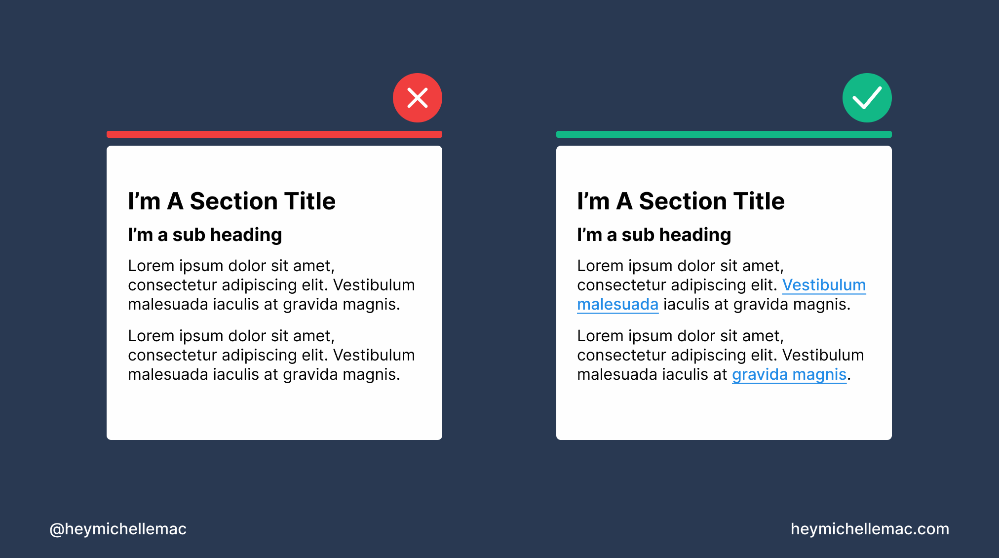
What This Means
It’s difficult to determine what elements on your website are links. Links are visually styled the same as text elements.
Why This Is An Issue
Links allow users to navigate through a website quickly and easily.
If a user can’t determine which elements are links, they need to spend more time and brain power trying to find the links on the page.
They may end up missing the links entirely and never find what they’re looking for.
Given our short attention span and low tolerance for broken or hard-to-scan interfaces, chances are users will simply leave your site and go somewhere else.
How To Fix This Issue
Add emphasis to link elements by making them bold, underlined, and/or a different color to text.
Also, ensure when hovered over or clicked on a link reacts accordingly by changing color or becoming underlined or bolded.
Issue 2: Inconsistent icons
![]()
What This Means
The icons on your website look like they were all picked from different icon libraries. They all have different thicknesses, colors, styles, or sizes which makes them look inconsistent.
Why This Is An Issue
Different styles of icons used on a single website creates more visual clutter. As there’s more visually happening on screen it can take the user longer to process and understand where to go.
Different styles of icons are also harder to understand. If the user understands one type of icon but the other icons are completely different it will make them second guess what the icons mean.
This confusion leads to a lack of trust in the website, the ultimate nail in the coffin for users leaving and going somewhere else.
How To Fix This Issue
Pick one good icon library per project and stick to it.
Unless you’re an enterprise business specializing in something quite niche, most icon sets these days will have a great selection of icons to choose from.
Thankfully there are lots of icon sets to choose from. Here are 3 I recommend:
If you’re looking for more recommendations like this, check out my newsletter Design Insight where I recommend 2 tools or resources each week plus other helpful things for creators who want to level up their design skills.
If your website is particularly niche and requires some very specific icons, have a set commissioned or buy a specific set to use for that project.
If you’re feeling especially creative, why not design an icon set for yourself!
Issue 3: Buttons are too small
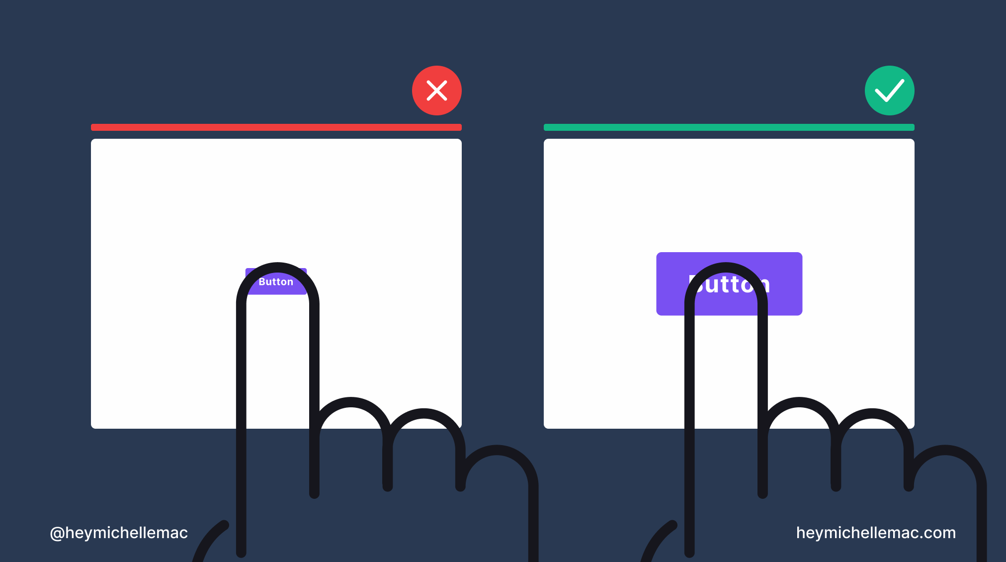
What This Means
The tabbable/clickable area of buttons is difficult to press because it’s so small. No matter how many times the user tries to click on or near a button, they miss and the button does nothing.
Why This Is An Issue
Even the most dexterous person can find it challenging to consistently tap a button with a very small tap target size.
The frustration caused by not being able to interact with a button leads users to question if the button is broken which in turn decreases the user’s trust in the website.
How To Fix This Issue
Thankfully this issue is easily fixed by increasing the size and in turn the tap target area of your buttons.
It’s recommended you increase the size of buttons to be at least 26px X 38px in size to ensure they can be clicked or tapped on easily.
It’s important to test this out across different devices to ensure the sizing is clickable with a mouse but also tappable with a finger.
Issue 4: Incorrect mouse cursor for various interactions
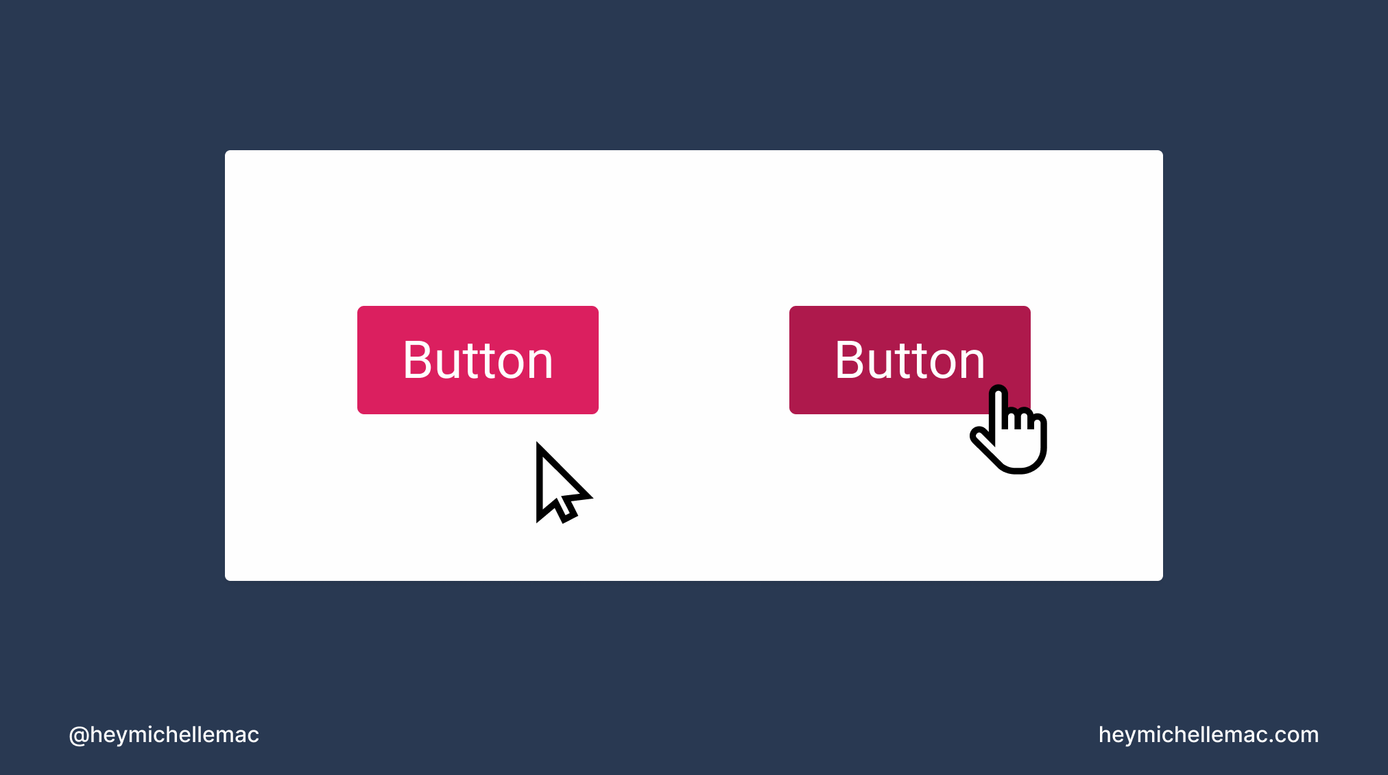
What This Means
Hovering over a button for example doesn’t change the mouse cursor to a pointer-style cursor.
Why This Is An Issue
We’ve all been “surfing the web” now for several years and over that time we’ve built up mental models for how we expect websites to behave.
One such mental model is the idea that the mouse cursor should give us an affordance for how we can interact with the component underneath it.
Look at your mouse cursor as you hover over this text. Next, hover over the links on this article. Notice how the mouse cursor changes to show you the different ways you can interact with website elements.
If the mouse cursor doesn’t change, this small visual indicator doesn’t give the user any helpful context for how to interact with a particular UI component.
This could lead to confusion and frustration on the part of the user.
How To Fix This Issue
Fixing this UI issue boils down to using the correct mouse cursor for each type of interaction.
For instance, the cursor should change to a pointing hand (pointer) when you hover over buttons and links.
There are several different types of mouse cursors to select from so I suggest reading the MDN web docs from Mozilla to learn more: cursor css - MDN.
Conclusion
After reading this I’m sure you’ll agree that good design often goes unnoticed. It’s when there’s a problem with your website that users sit up and pay attention in a negative way.
Hopefully, if you take on board the fixes for each of these issues, you’ll be on your way to happier users that trust your websites and continue to return again and again.