How To Improve The Usability Of Password Fields
Password fields are a necessity if you’re designing a login or sign-up form for your application. As common as these types of fields are, they can be frustrating to interact with when poorly designed.
I was recently tasked with improving the usability of the login page on one of our apps at my job.
To learn more about how to implement these components in a user-friendly way, I spent some time researching.
From my research, I created a set of mockups that the development team has since implemented across our app ecosystem.
In this article, I have put together everything I’ve learned from my research into password fields. By reading this article and applying what you learn from it, you will dramatically improve the usability of password fields in your own designs.
The Components Of A Password Field
Let’s start by looking at the components that make up a password field.
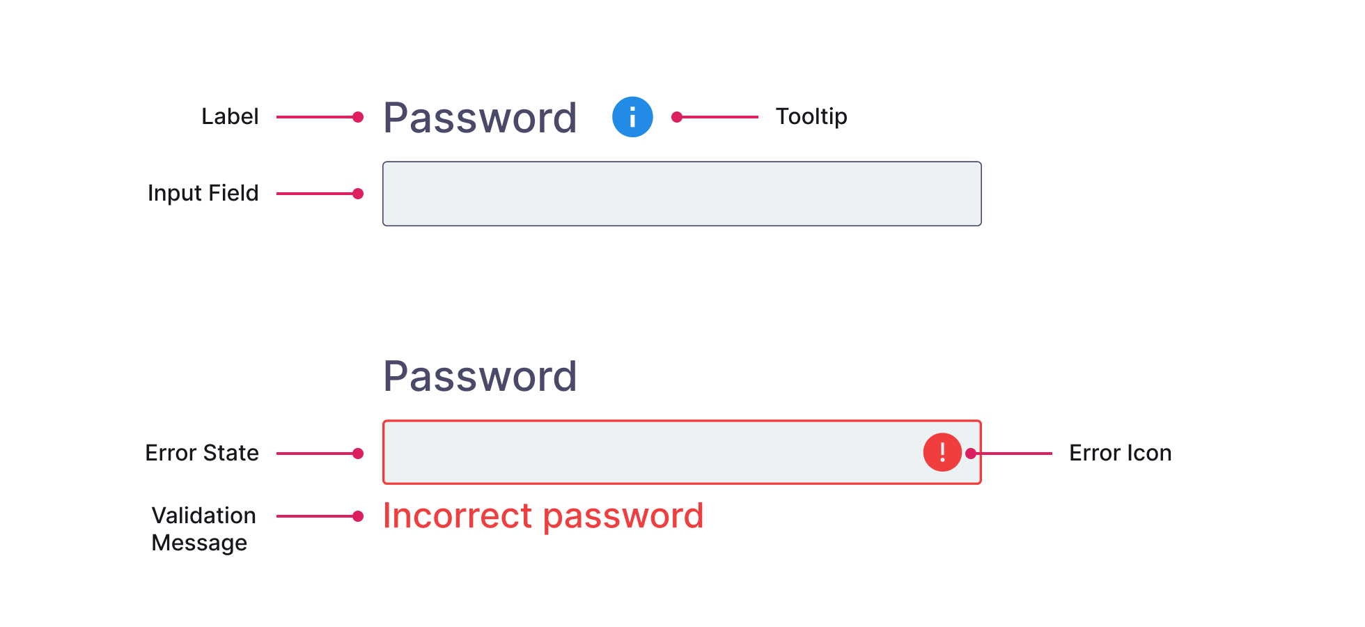
As with most form fields, a password field is made up of the following:
- A label that describes the field - Password.
- The input field itself where the user enters their password.
You may also see:
-
Confirm Password - An exact duplicate of the password field. By typing your password out twice you’ll be sure you’ve typed the right password and are less likely to forget it. Read this article to learn about why this field must die.
- Password Hints + Tooltips - If you’re on a sign-up screen and the password field has specific requirements, a tooltip or info panel is displayed so the user can view this information.
- Validation - If the password is entered incorrectly, a validation message appears next to the password field. You may also see an icon appear and the input itself should turn red in color to indicate there is an issue.
- Forgot Password link - Though this is not linked to the password field itself, a forgot password link is usually located next to this field so the user can reset their password.
What Is Password Masking?
If you’ve done some research into the world of password fields you’ve likely come across the term password masking.
Password masking is where the password you type into a password field is ‘masked’ or hidden behind bullet points or asterisks.
This is a pretty common practice across password fields. In fact, it’s done by default if you use the password input type in HTML:
<input type="password" id="pwd" name="pwd">
Masking passwords ensures your security when typing. It prevents any ‘over the shoulder’ spies from peeking at your password.
While there are advantages to password masking, it can also cause some usability problems. We’ll look at how to address this in the next section.
Improving The Usability Of Password Fields
When passwords are masked, the user can’t see what’s being typed.
If you can’t see your password as you login, you’ll be frustrated when you’re told your password is incorrect but you’re certain it was correct.
The frustrations caused by this password masking may result in you choosing a simple password in the future. This might be easier to type but in the long run, it’s much less secure.
So how do we actually improve the usability of password fields that use this password masking technique?
The answer is: we allow the user to toggle the visibility of their password.
If a user has control over the visibility of their password they can easily check they’ve typed it correctly.
This also improves the user’s overall experience of using the app because it behaves how the user expects it to.
What’s more, this also removes the need for the confirm password field. Removing this component simplifies the UI, reduces complexity, and removes an unnecessary step for the user.
OK, so we know what the solution is technically speaking, but how do we actually design and implement it?
There are actually 2 ways to implement this show/hide password functionality:
- With iconography - usually an eye icon
- With show + hide text
Let’s look at each possible implementation and see how they work.
1 Iconography - Eye Icon
This is the implementation I see the most on the websites I visit:
- There is an eye icon next to or inside the password field.
- When you press it once, your password becomes visible and the eye icon changes.
- When you press it again, your password is masked/hidden again and the eye icon changes.
While this sounds simple, it’s quite surprising how much variation there is with this implementation.
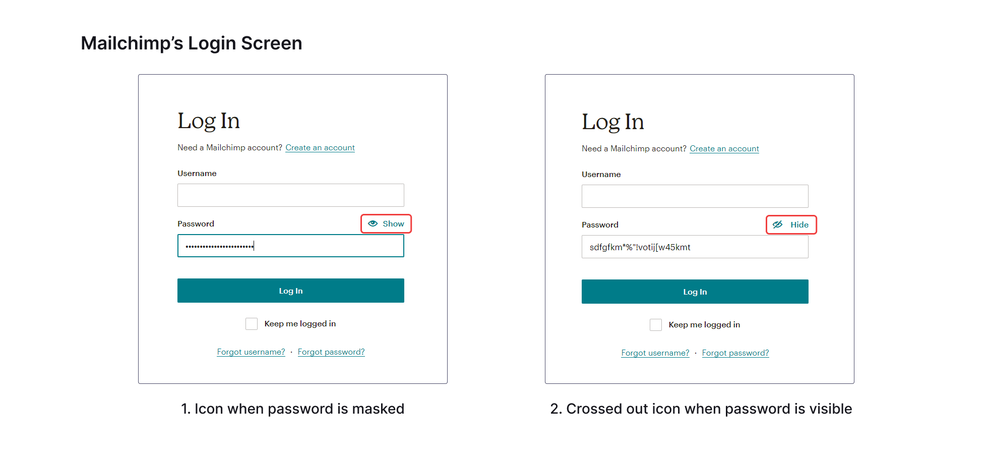
Take Mailchimp as an example.
The eye icon is normal when the password is masked (not visible). Then it switches to a crossed-out eye icon when the password is visible.
This approach indicates the action that’s performed when you press the icon.
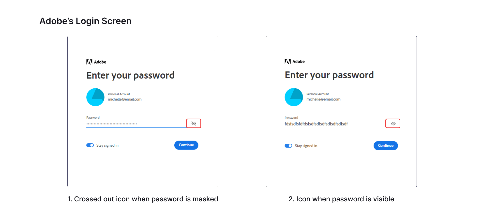
The Adobe login screen has the opposite approach.
In this case, the crossed-out icon is displayed when the password is masked, then it switches to the regular eye icon when the password is visible.
This approach denotes the current state of the password field.
So which implementation is the correct one?
Both are correct so long as they are implemented consistently across an app or system. Pick one method and stick with it.
2 Show + Hide Text
While the iconography approach is the most used option, the Show + Hide text approach is more user-friendly.
It leaves no room for interpretation and is faster to understand.
Instead of an eye icon and a crossed-out eye icon, you simply replace them with text.
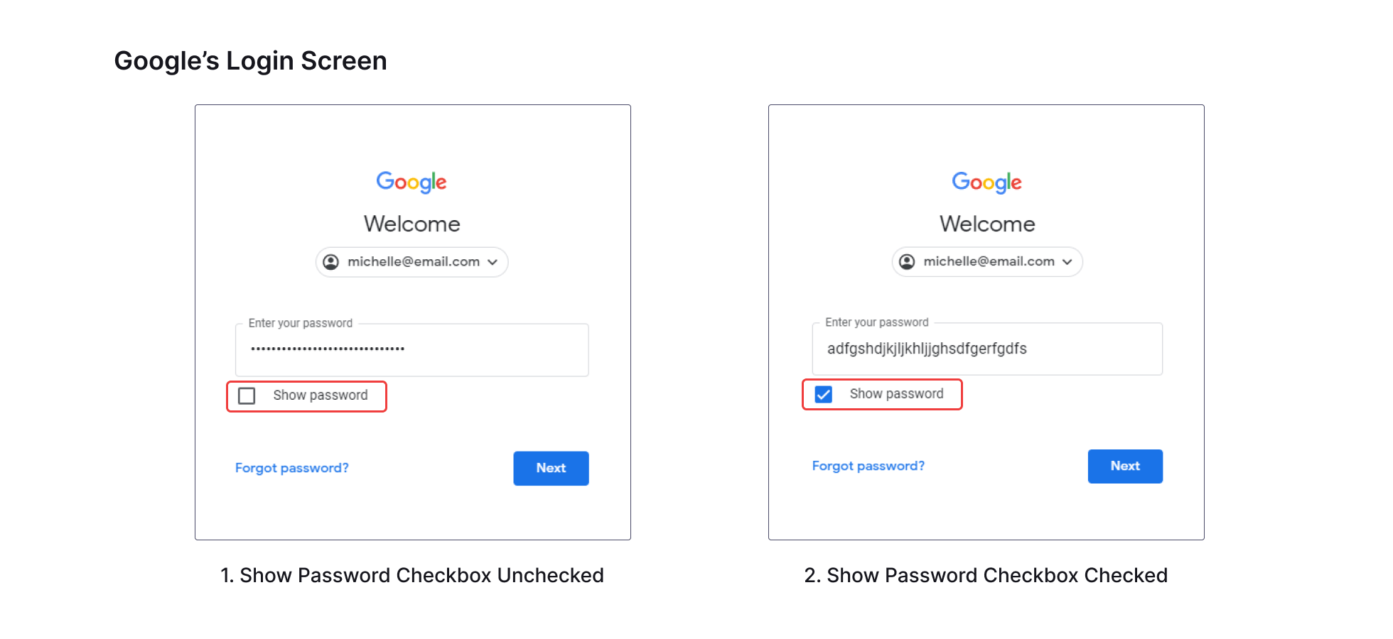
Google’s approach on their login screen is to include a Show password checkbox under the password field. This is a very intuitive approach and probably the most straightforward to implement.
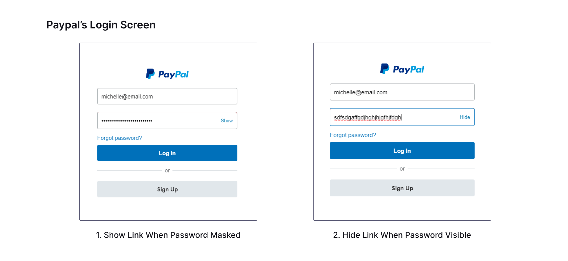
PayPal’s approach is to use the text Show and Hide to toggle password visibility:
Which Option Is The Best?
Each option has pros and cons but option 2, the show + hide option, is the easiest to understand and leaves little room for interpretation.
This is the best option in most cases if you are trying to design something with optimal usability in mind.
Conclusion
I learned a lot from researching this topic and I enjoyed putting this information together.
With that said, I truly hope you found this article helpful and learned something new as a result.
If you want to learn about password creation itself in more detail, here’s a great article I recommend from NNGroup.com: Password Creation: 3 Ways To Make It Easier
Have anything you want to add? Do you have any other examples of password fields? Let me know over on Twitter.
Thanks for reading!