6 Things Pokémon Cards Will Teach You About Design
Pokémon cards are so hot right now!
According to nintendolife.com, the Pokémon company sold 3.7 billion cards in 2020 + 2021. Even though the Pokémon franchise is now 25 years old, it’s still highly popular among all age groups, especially Pokémon cards. Those who grew up with it, and those just learning about it are buying Pokémon cards left and right to complete their collections, battle against others, or sell them on for a profit.
Having gone down the rabbit hole of actually buying Pokémon cards myself, I’ve found there are a number of valuable things they can teach you about design.
So, if you’re interested to learn what Pokémon cards will teach you about design, this article is just for you. I’ve put together a list of 6 things you can learn from and apply to your own designs to become a better designer, all thanks to Pokémon cards.
1 Use Color To Convey Meaning
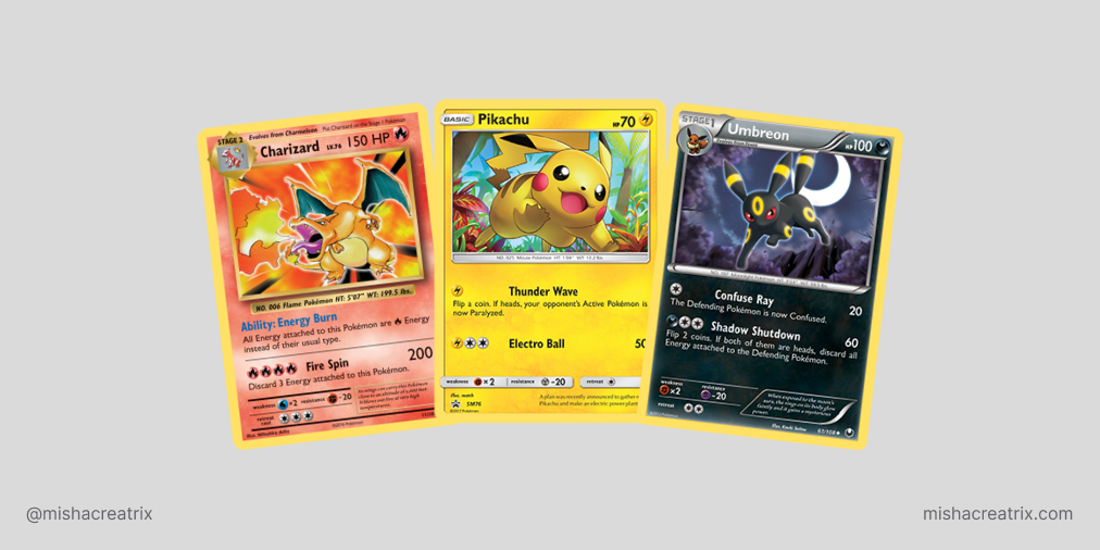
Color is used to convey the Pokémon type.
I’m going to assume you have some level of knowledge of Pokémon and you know about types of Pokémon and their strengths and weaknesses. If this is completely new to you, here’s a resource you can check out: Pokémon Types & Type Chart.
As a very high level overview, Pokémon are assigned a certain type (fire, water, normal etc) and each type can have strengths and weaknesses.
This is an important factor for Pokémon trainers to consider so this makes type a very important piece of information to include on Pokémon cards. With that in mind, let’s take a look at this Pikachu card and see how it’s done:
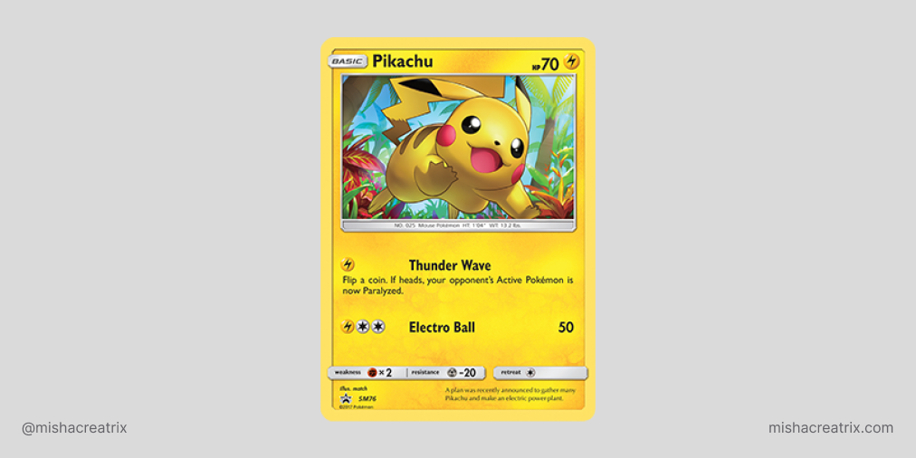
The color used on each Pokémon card conveys meaning, in this case the Pokémon type. It’s pretty obvious this Pokémon is electric type because the entire card is a shade of yellow. There are other components that also denote the type but color is the most easily recognizable factor.
This is a highly effective use of color and something you can learn from and apply to your own designs.
2 Don’t Rely On Color Alone To Convey Meaning
I mentioned this above but color isn’t the only way to identify the Pokémon type.
In the top right corner of a card is the type symbol. Looking at the Pikachu card again, we can see there is a lightning bolt symbol to denote electric type. These might seem a little alien at first but after a short amount of time you’ll quickly be able to identify the different types by symbol alone.
These type symbols are used in other areas of the Pokémon card to signify:
- The type of energy cards you need to perform an attack
- What typing the Pokémon is weak against
- What type the Pokémon is strong against
- The type of energy cards needed to retreat the Pokémon
![]()
Colors and symbols are both used to denote type and you can see color alone isn’t used to convey meaning. This is particularly helpful if someone is color blind and isn’t able to make out the difference between green and red or blue and green. The fallback becomes the icon which is easily recognizable.
The lesson here is not to rely on color alone to convey meaning. You don’t know who will be interacting with your designs. Add iconography or easily recognizable symbols in addition to color to add more context and convey meaning to elements.
3 Use Texture To Add More Visual Interest
It would be easy to just add a block of color to the background of these cards and call it a day.
However, that’s not the case here. A texture is created on each type of card by incorporating similar or complimentary colors into the background with brush strokes or patterns. This effectively adds more depth and visual interest to the design of each card.
As you can see from the screenshot below, the use of texture doesn’t overpower the design. It has some visual interest but doesn’t affect your ability to read the text.
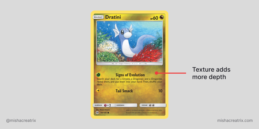
This is something you can learn from and apply to your own designs: consider a subtle texture or pattern to break up a blank background but don’t allow it to distract from the main content.
4 Use Font Size To Create Visual Hierarchy
A visual hierarchy is created when you use different text to denote the importance of the content. This includes the size and weight of text.
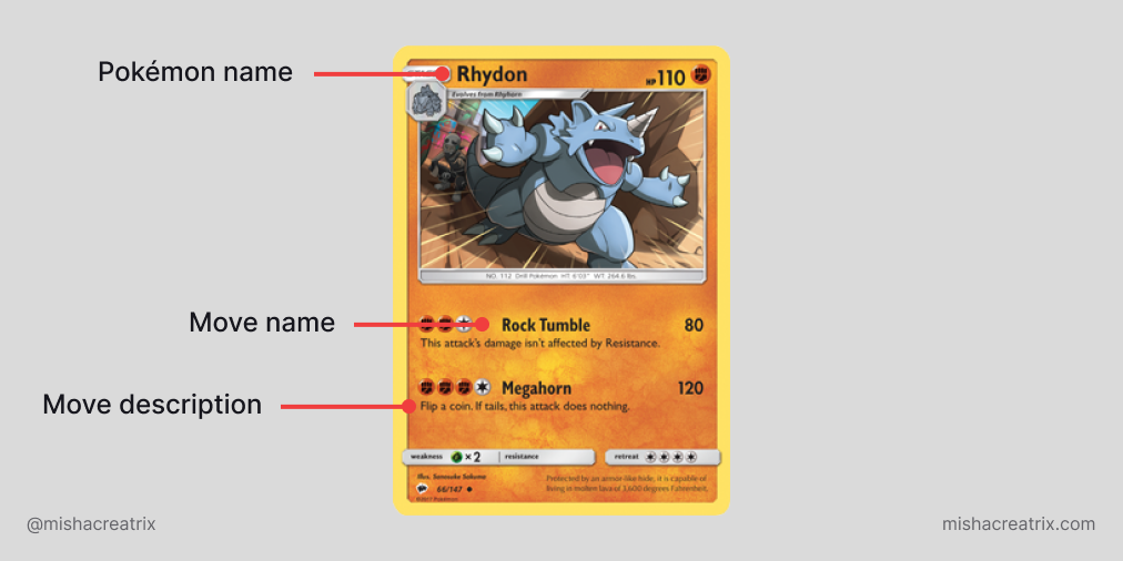
For example, the Pokémon’s name is most important so it’s placed at the top and in the largest, boldest font. This immediately draws your eyes to it.
The next most important piece of content is the Pokémon’s HP. This is found next to the name and in slightly smaller slightly less bold text.
As your eye moves down the card, the next most striking content is the move set and associated attack damage. These components are written in smaller text than the Pokémon name and HP.
This continues throughout the card so by the end you have all of the information you need and you’ve read it in logical order. This pattern makes it easy to find the most important information and allows for a quick scan of the card to find what you’re looking for.
Pokémon cards are an excellent example of visual hierarchy so they’re an excellent resource to learn from on this subject!
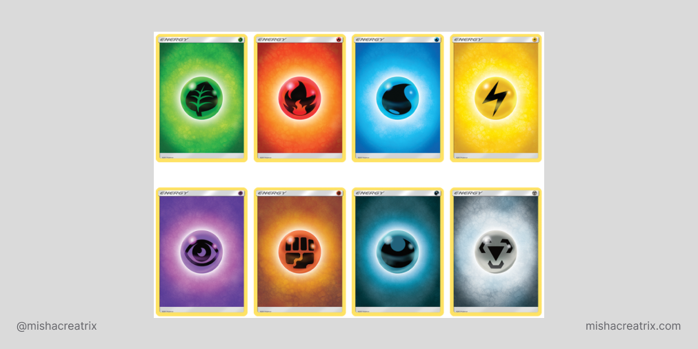
5 Iconography Can Be An Effective Way To Simplify Content
We mentioned iconography when talking about Pokémon Type in the Color section but it’s worth expanding on here.
To recap what we already discussed, different icons are used to represent typing e.g. Water, Fire, Grass. Each Pokémon is a specific type and can have various strengths and weaknesses to other Pokémon types.
The type iconography is well-designed and simple. It’s instantly recognizable as an advanced player but easy to learn as a new player.
It uses color to add to the meaning but take away the coloring and you can still recognize what each icon means.
In addition to type iconography, there are also icons that denote the rarity of the card and the set the card belongs to. Let’s briefly look at each of these.
Pokémon card rarity is used to denote the value of a card. There’s a lot more to determining the actual value of a card but for the sake of keeping things light, let’s just leave it at that.
There are 3 main types of rarity:
- Common - represented by a circle
- Uncommon - represented by a diamond
- Rare - represented by a star
What I like about this approach is the more sides the shape has, the rarer the card. It’s an easy system to remember and instantly recognizable when scanning a card.
You can learn more about card rarity here:
Pokémon card set symbols deserve an article on their own but for the interest of this article, these symbols denote the set cards belong to.
This is used to help players identify which cards can be used in competitive play and which cards are no longer in use competitively. It’s also another way to determine the value of the card as very old card sets can be worth a lot of money.
You can find out a lot more about set symbols here:
The big lesson here is that iconography, when used effectively, can be a great way to simplify content.
6 Quality Is Important
The perceived quality of something will affect how people see it, how they feel about it, and how they enjoy it.
While there is no one tangible thing I can point to here to give you an example of quality I will say, it’s about the design as a whole.
All of the points we talked about are used effectively here to add to the quality of the design of these cards. The use of color, iconography, typography, alignment, whitespace all combine to create a visually pleasing design that’s easy to understand.
Side note: We could start talking about the impact of nostalgia and collectibles and how that affects things but let’s stick purely with the design aesthetics.
Consider this: how you make use of design techniques will affect the quality of your design. Use them well and you’ll create an aesthetically pleasing design that works well. Use them incorrectly or not at all, and you’ll lose your audience.
My Key Take Aways
As you can see from this list, there are lots of things you can learn about design from Pokémon cards.
With that in mind, I hope this opens your mind up to the possibility of learning about design from other areas outside of traditional mediums like websites, mockups, tutorials etc. Design is everywhere, you just need to stop and take notice of it to learn from it.
I hope you learned something from this article and it inspires you to delve into the world of Pokémon cards or even consider other places you can learn about design.
If you have any insights you’d like to share on this topic, please let me know over on Twitter :)
Finally, if you enjoyed this article here’s the original Twitter thread I wrote: Original Twitter Thread