Creating A Great Twitter Header Shouldn't Take Weeks. Here's How To Design One In Under An Hour
When you’re done reading this, you’ll know exactly how to design a captivating Twitter header in under an hour without any design experience.
Once you’ve mastered this you’ll be able to design a Twitter header that:
- Looks like it was professionally designed
- Drives more followers
- Encourages people to buy your product or service
- Makes people want to subscribe to your newsletter
Most people don’t use their Twitter header to its fullest potential because they think designing a proper one takes a lot of time and money.
In reality, you can design a great Twitter header in under an hour with the right process. Here it is, step by step:
Step 1: Identify 1 Goal For Your Twitter Header (10 mins)
Having 1 clear goal for your Twitter header is crucial. This ensures your design is simple and focused.
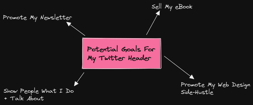
Spend 5-10 minutes brainstorming what you want to use this valuable real estate to promote.
Here are the most common examples:
- Promote your newsletter
- Sell your new book/digital product/course
- Show people why they should follow you
- Promote your YouTube/Twitch channel
- Promote your web design service

Once you’ve picked one strong goal for your Twitter header, it’s time to move on to the next step.
Step 2: Gather Inspiration From Other Twitter Profiles (15 mins)
Finding inspiration from others is the secret sauce for designing a great Twitter header.
You may be sick of me saying it and sick of seeing it online but you don’t need original ideas to be successful.
Nothing is truly original:
— Michelle Mac (@heymichellemac) May 27, 2021
• Pretty much everything has been done before
• This might seem distressing until you realise all you have to do is remix existing ideas
• Your experience, interests, skills give you a unique insight
The goal here is to take the pieces of other headers you like and combine them into your own unique header.
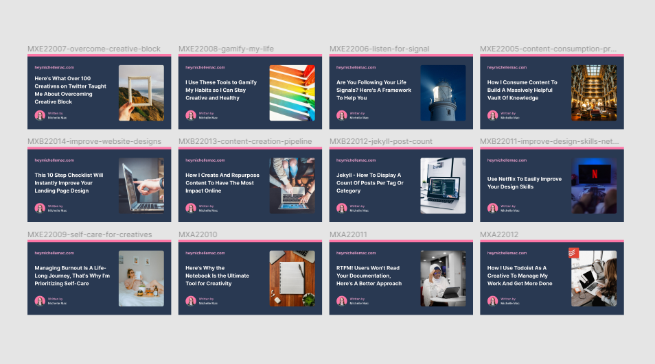
Spend 15 minutes looking at other people’s profiles and take screenshots of the ones you like or the ones that immediately catch your eye.
You can check out my Twitter header over on Twitter if you’re looking for some inspiration: @heymichellemac.
I used Figma to collect design inspiration for my Twitter header but you could also use Notion, Canva, or just a folder on your desktop.
Step 3: Take The Bits You Like And Re-Purpose Them (30 mins)
This is where the magic happens.
For each screenshot you collected, make note of what parts you liked and why.
Bigger picture here, doing this practice regularly will develop your design palette i.e. what you like and don’t like. This will make designing easier in the future.
Once you know what you like, set up a new Figma file (or whatever design tool you like) and start creating.
Figma allows you to create artboards to the exact dimensions of a Twitter header image but here are the dimensions just in case you need them: 1500 px (width) X 500 px (height).
If you’re looking for a quick start for getting up and running creating your Twitter header in Figma, I created this free resource which has all the artboards you need already set up and ready to go: Social Media Kit - Figma.
It should go without saying that you don’t want to blindly copy and paste the exact design of another header you like.
Instead, you should take inspiration from other designs and make your header your own by changing up the font, layout, color palette, and wording.
For example, most of the graphics I put out online follow the same color palette. Something as simple as this creates a sense of consistency to the point where you see one of my graphics and say hey, that’s something from Michelle, I recognize the colors.

There’s no need to be super complex with your design either.
Some of the clearest, most eye-catching Twitter headers I’ve seen are nothing more than a few lines of text against a colored background.
Focus on getting your message across in a simple, clear way and you’re 90% of the way there.
Tips For Optimum Header Images:
- Remember to account for the profile image which slightly overlaps into the header image.
- Proper format - Twitter supports JPEG, GIF, and PNG file formats.
- Smaller images = better - run the exported image through a tool like TinyPng to compress it. The max allowed image size is 2MB.
- Avoid gradients - It’s hard to get gradients right unless you spend hours tinkering with them.
Step 4: Test Out Your Design On Desktop + Mobile (5 mins)
This is a step I’m sure most people forget about: testing your new header design on different devices.
Your Twitter profile looks slightly different on mobile than on desktop so it’s important to account for this in your testing to make sure everything looks OK.
A common thing I see on header images is they don’t account for the profile image that overlaps the header image.
This could potentially cut off important content so be sure to check for this.
It’s also important to make sure you can read any text in the header image because this could be a lot smaller on mobile than you think.
Make any tweaks accordingly and test it out again until you’re happy with how it looks.
Step 5: Share The Update With Your Audience (bonus points)
The last step is to let your followers know you’ve just updated your Twitter header.
Let them know you learned how to do it from this article for bonus points ;)
Feedback is an important part of any design process so any feedback you can get from your audience is invaluable.
There may be some aspects of the design you can tweak based on feedback. Or maybe there’s a typo you didn’t spot until someone pointed it out to you.
TL;DR
- Identify 1 goal for your header (10 mins)
- Gather inspiration (15 mins)
- Take the bits you like and re-purpose them (30 mins)
- Test your design on desktop + mobile (5 mins)
- Share the update with your audience (bonus points)
Creatorpreneur Tip: If you want to take this all to the next level, take what you’ve learned from this article and start a Twitter header design side hustle. You can offer this service to other people on Twitter if you can showcase your ability to design something quickly and effectively.