What's the deal with road signs anyway?
A version of this post first appeared in my newsletter. Subscribe to receive posts like this in your inbox every Friday.
We rely on road signs to navigate safely in our vehicles. When these signs are missing, obstructed, or poorly designed, it puts our safety at risk.
I was driving home from visiting family the other week and I’m embarrassed to admit it but I almost had an accident.
I took a slight detour on the way home which takes me through an area with a train crossing. As I was driving through it, I realized the lights beside the crossing were flashing. I didn’t really think anything of it until seconds later when the barriers closed to allow a train to pass.
Immediately after the incident, I was stricken with fear thinking of the near miss I just had. I began to wonder what I missed, and how I didn’t realize I should have stopped the car.
A few things came to mind:
- I completely missed the signage around the train crossing because it was half overgrown.
- The flashing light didn’t signify any danger to me. I live near a zebra crossing with a perpetually flashing set of lights so I’ve grown accustomed to this flashing and don’t see it as anything “dangerous”, merely something to be aware of.
- This was probably my second or third time actually driving through a train crossing and it occurred to me other people are likely the same. Because we’ve no familiarity with how we’re supposed to behave here, we need to depend on the signage and various signifiers nearby. When these are missing, obstructed, or lacking in clarity, we have nothing else to go on.
Every year it seems the news shows videos of “reckless drivers” who drive through train crossings and I’d always brush it off. “What idiots” I’d think. Now, of course, when the barriers are down and you still try and drive through a train crossing that’s a separate matter. But since my near miss recently, I realized how easy it could happen.
With all this in mind, I realized how little I knew about the road signs I see (or don’t see!) every day. So a deeper dive was warranted!

Irish road signs take inspiration from UK road signs
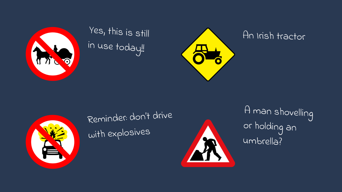
During my deep dive into the topic of road signs in Ireland, I quickly came to learn that a lot of our road signs were copied from the ones used in the UK.
So to learn about Irish road signs and where they came from I needed to start with the signage in the UK.
As is the case with most of my deep dives, I quickly ended up on YouTube and was fascinated to find an interesting episode of Top Gear related to this topic. In this particular episode, James May was test-driving a car and invited along a woman called Margaret Calvert.
Margaret Calvert is a British graphic designer and typographer. As I learned from watching the video, Margaret and her colleague Jock Kinnear designed many of the road signs still in use today in the UK.
Back in the 50s as motorways were being introduced into the UK, people quickly realized the road signs at the time just weren’t up to the job. With that in mind, Margaret and Jock used their wealth of design and typography knowledge to create a set of road signs that were easy to read as you sped past them in your car. The pair also designed the “Transport” typeface which is used on these road signs.
Coming back to the signage used in the Republic of Ireland.
Road signs here are specified in the Traffic Signs Manual 2010 (TSM) and managed by the Department of Transport. I skimmed the manual and was amazed at the detail in it relating to where signs should be placed, how big they should be, and what signs are required in different places.

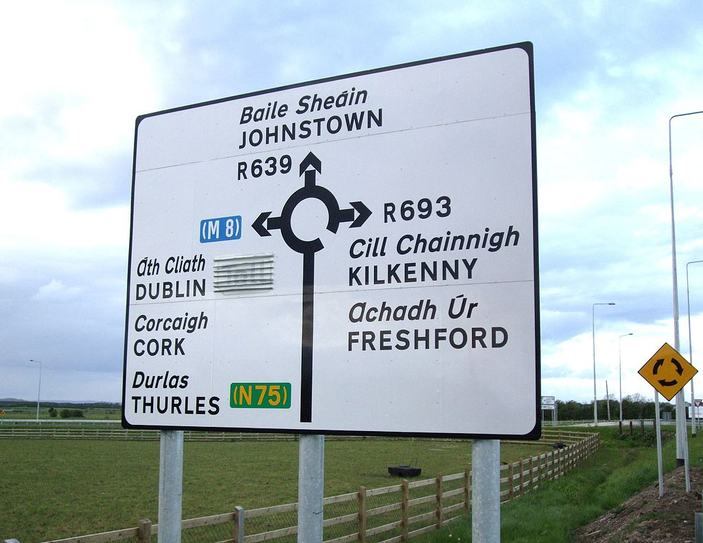
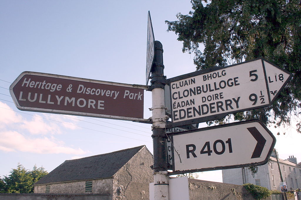
The typefaces used on our road signs are Transport and Motorway, both designed by Margaret and Jock.
Something I love about Irish road signs
One of the unique things I actually really love about Irish signage is the inclusion of the town name in Irish. I’m delighted by the little bit of culture and history something like that captures.
As someone who learned Irish all the way through primary and secondary school I never really appreciated it until I left school and could look at it in my own time when my own interest pulled me towards it. Now I’m not a fluent speaker by any means but it gives me a little bit of delight any time I see some Irish and immediately know what it means.
We’ve veered drastically off-topic here but maybe something to come back to another time 😅

Thinking about how things are made
Well, in terms of the UX of road signs, I think I have more work to do here.
For one I need to return to the scene of the crime, the railway crossing, and take another look at the different signage in place. Even though I didn’t get to the bottom of it here, I still think the signage used could be improved to cater to all road users.
It’s fascinating to think that design, usability, and goodness knows how many other factors all go into the things we see and interact with.
Sure I guess on some level this is pretty obvious right? But actually taking the time to look into why a road sign is the way it is, or what makes a water bottle worth signing up for a massive wait list for, it all makes me appreciate the world around me a lot more.
I think that’s why I’m finding it so much fun to research and write this newsletter each week. I enjoy noticing little things and diving into topics I otherwise would never think to give a second look.
Follow your curiosity!