These 4 Typography-Related UI Issues Are Costing You Money! Here's How To Fix Them
Simple UI issues in your website can be the difference between a conversion and a bounce.
I’ve been building websites for almost 10 years and I come across the same font/type-related issues all the time when browsing online. That’s why I’ve put together this list of the 4 most common type-related UI issues you can easily fix today.
I’ll describe what these issues are and show you how to fix them. This will help you to create a better experience for your users which will ultimately increase your conversions.
Issue 1: Long blocks of text
What This Means
Your website has walls of text without suitable paragraphs or proper spacing.
Why This Is An Issue
Users scan, they don’t read. They are trying to scan over an entire web page in seconds to find what they’re looking for. If they don’t find it, they move on.
Think about how you browse the internet.
Say you’re looking for a recipe for Chicken broth. You’re not going to read a big explanation about how Chicken broth is great and has lots of health benefits. Sure that information is helpful but you just want the recipe because you have the leftovers in front of you right now.
You’re going to scan each web page looking for a suitable ingredients list and step-by-step method. If you don’t quickly find this, you’re going to move on to the next web page.
This is why you need to design your websites with scan-ability in mind.
How To Fix This Issue
Think of it like this: To create designs that allow for scanning, you need to imagine you’re designing a billboard going by at 60 miles an hour.
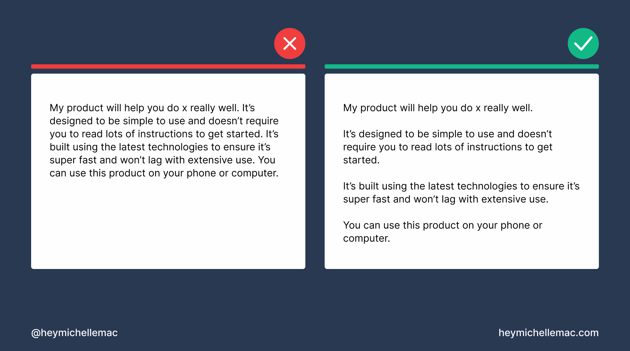
The fastest way to fix this issue is to break long chunks of text up into many paragraphs. A good rule of thumb is to keep paragraphs limited to 3-4 sentences.
Another great way to fix this issue is to use lists i.e. bullet points and numbered lists where appropriate.
If you’re describing a step-by-step guide for how to do something, use a numbered list. If you’re listing off your favorite movies, use a bulleted list.
Generally anywhere you use lots of commas or lists of things is a good candidate for a bulleted or numbered list.
Issue 2: No type hierarchy
What This Means
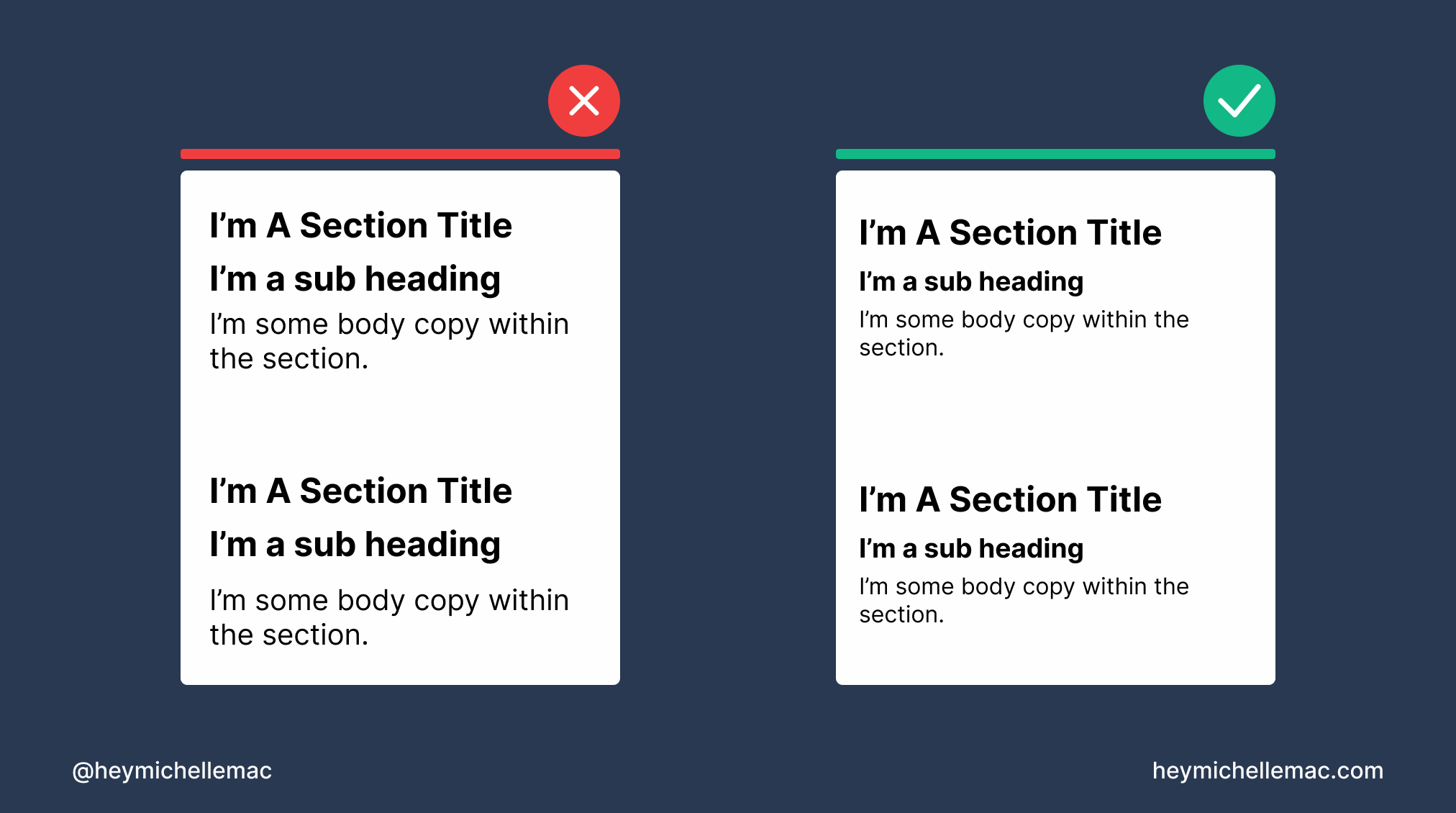
All text is the same size on a web page. Paragraphs are the same size as headings which are the same size as lists etc.
Why This Is An Issue
All content on a web page should follow a hierarchy. Bigger things are more important than smaller things.
This is how users can quickly get a sense of the most important and least important information on a page.
When there is no hierarchy to the text on the page, it’s hard to understand the structure and importance of the content. This makes scanning the page that much more time consuming.
We’re coming back to scan-ability here again and ensuring the user can easily find what they’re looking for.
How To Fix This Issue
Simply put you want to make headings bigger than plain text. H1s should be bigger than H2s which should be bigger than paragraph text.
You don’t have to reinvent the wheel with each new thing you design so in this case design frameworks are your friend.
If you’re using an existing design framework like Tailwind CSS, this has different font sizes already built in as long as you make use of the appropriate classes and styles.
If you’re looking for something more customizable to help you understand how everything works, I recommend using a tool like Type Scale.
Typographic scale could be a whole article in itself but I really like this video as a quick intro/explainer:
Also, Pokémon cards are an excellent example of good typographic scale: 6 Things Pokémon Cards Will Teach You About Design
Issue 3: Too many fonts
What This Means
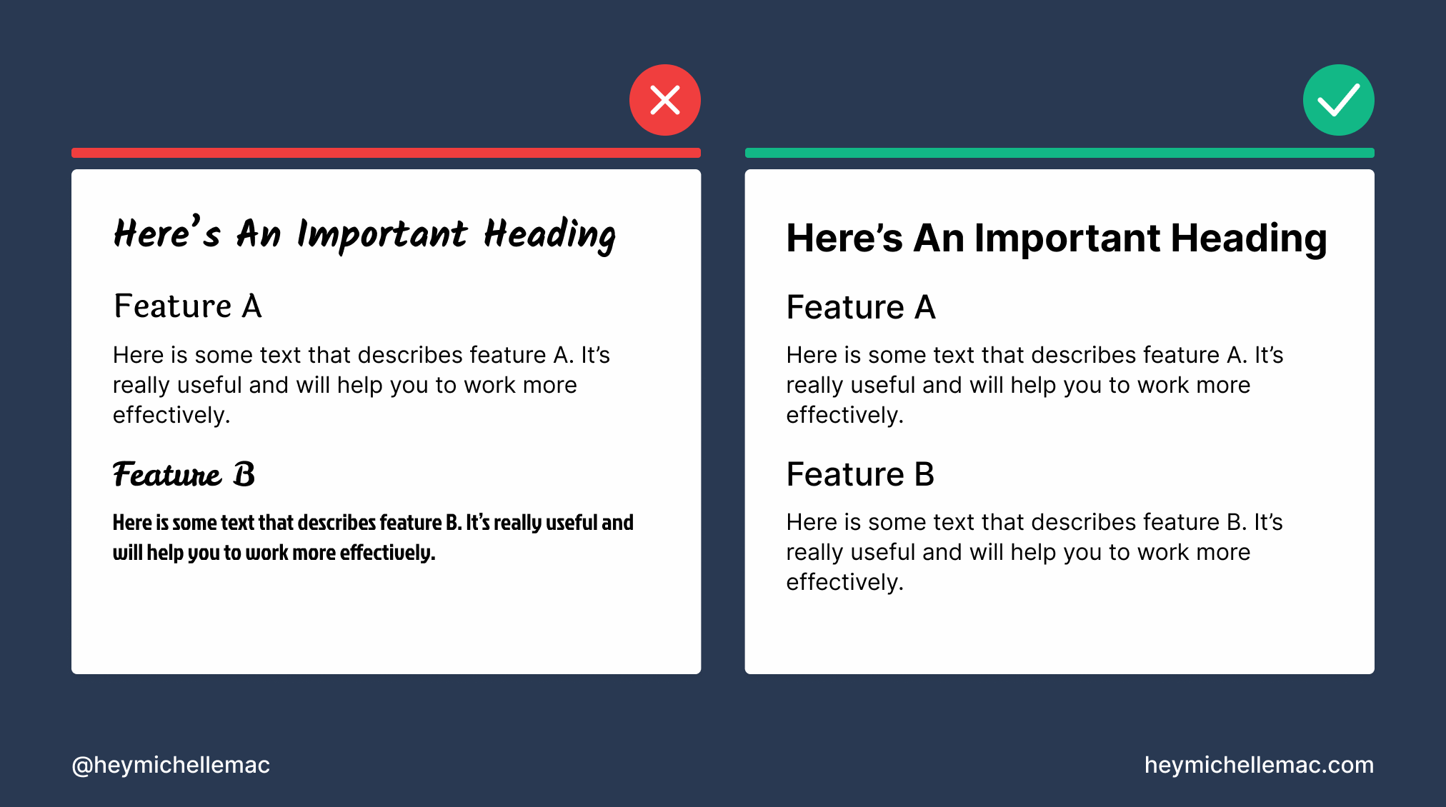
There are too many visually different fonts used on the web page.
Why This Is An Issue
Need a quick refresher on fonts?
Typography Essentials pic.twitter.com/ooN1LqTuDD
— Michelle Mac (@heymichellemac) May 12, 2021
Using too many different font families on a web page increases the user’s cognitive load (the amount of brain power required to understand and effectively interact with the web page).
If there’s too much going on visually, the user will have a hard time finding what they’re looking for with their limited attention span.
How To Fix This Issue
Pick 1-2 different font families max per design project or website.
To keep things even more simple I’d recommend using 1 font but varying the font-weight and size to still have enough contrast.
Issue 4: Line length is too long
What This Means
Text is too wide on the web page. It stretches from the far left to the far right of a large monitor without any breaks or spacing.
Why This Is An Issue
Noticing a trend here? Most of these design issues revolve around making your content easy to scan and this one is no exception.
This issue used to always catch me out. However, now that I’ve implemented a max width for the content across all my designs, I’ve noticed a marked improvement in how easy everything is to read.
How To Fix This Issue
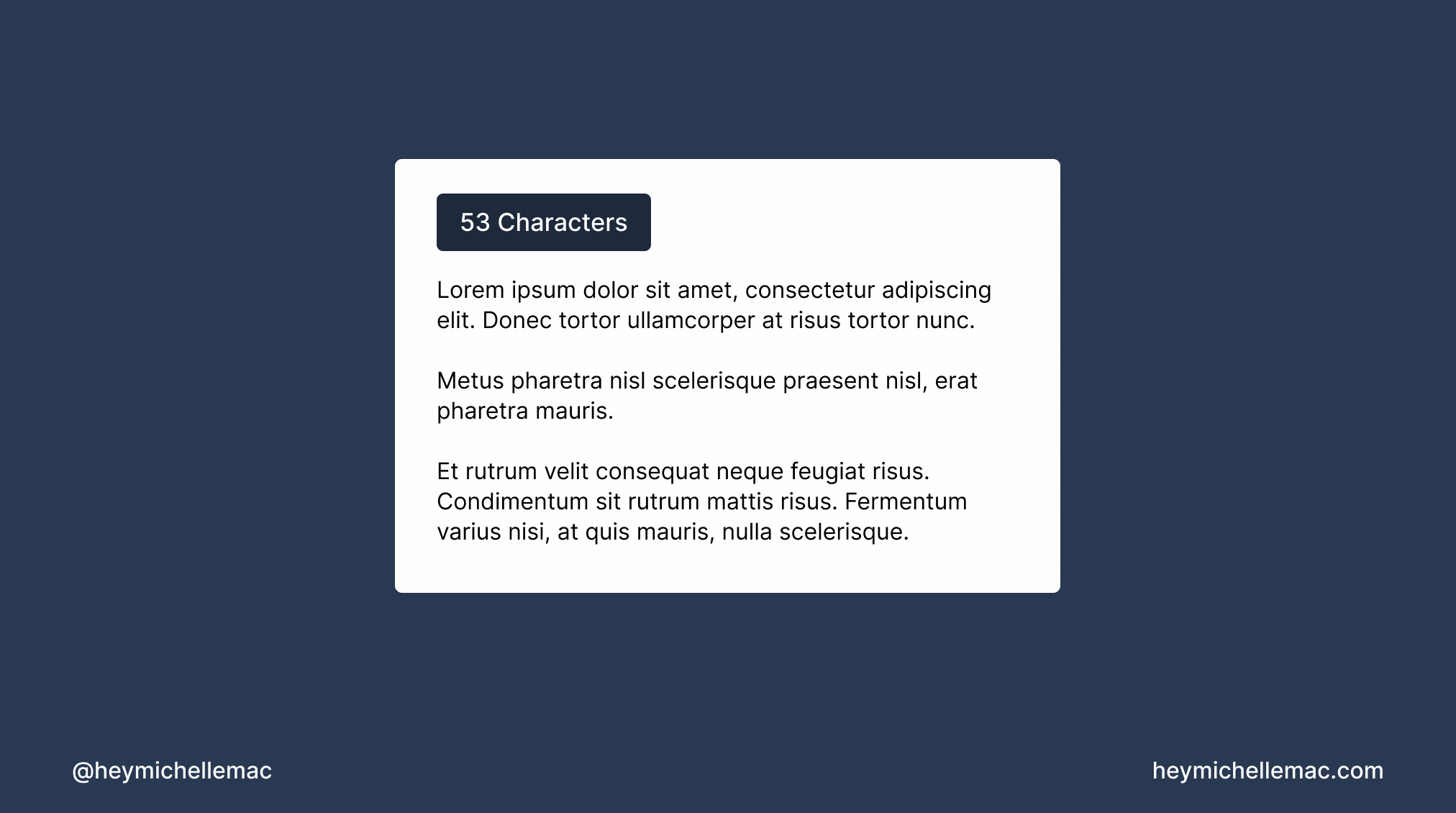
A good rule of thumb is to limit line length to 50-60 characters per line.
You can check this in your designs using a plugin if you’re using a tool like Figma.
You can also set this during development through the use of the ch unit as a CSS width property.
Conclusion
If you’ve made it this far I’m sure you can see how pretty much all these design issues boil down to making your content easy to scan.
If it’s easy to scan, people can find what they’re looking for faster which keeps them coming back because they develop a trust in your website.